Helping enterprise leaders understand the effectiveness of their AI investments
Challenge
As GitLab expanded its AI-powered features beyond Code Suggestions, customers purchasing GitLab Duo needed a comprehensive way to measure ROI across their engineering organizations. The initial lean dashboard only tracked one feature, but customers needed to understand AI’s impact across multiple teams, tools, and productivity metrics.
My role
- I lead the design and reseach efforts (with support of the group’s UXR lead)
- Participated in customer calls with my PM to understand customer painpoints and needs
- Closely collabrated with my engineering manager, front and backend engineers on identifying contraits and iteration path
- Collaborated with other cross-funcational team members that were involved with delivering AI features
Approach
Understanding how customers measure productivity
I led the research effort, conducting interviews with Directors and Engineering Managers to understand how their teams measure productivity. Key findings:
- Visualize which metrics improved as a result of AI investments
- Compare performance between teams using AI vs. teams not using AI
- Track AI adoption progress across the organization
- Automate insight extraction from large volumes of performance data
I also conducted Jobs-to-be-Done research to better understand the ROI evaluation process from a leadership perspective.

JTBD map
Navigating technical and organizational complexity
The challenge was designing a horizontal solution that worked across GitLab’s diverse customer base. Not all customers use the same features - some use issue tracking, others don’t, some measure productivity through merge requests, others through pipeline performance or issue tracking.
Through close collaboration with engineering, I learned that the data infrastructure needed to be rethought to support cross-team analysis. I worked with backend engineers to understand data availability constraints and helped define what metrics were technically feasible to capture and aggregate.
Design exploration and validation
I explored multiple approaches to correlation analysis and comparison views, testing concepts with customers to validate which metrics would be most meaningful. This iterative process helped build confidence with stakeholders and gave engineering a clear roadmap.

Correlation explorations

Team comparion explorations
Solution
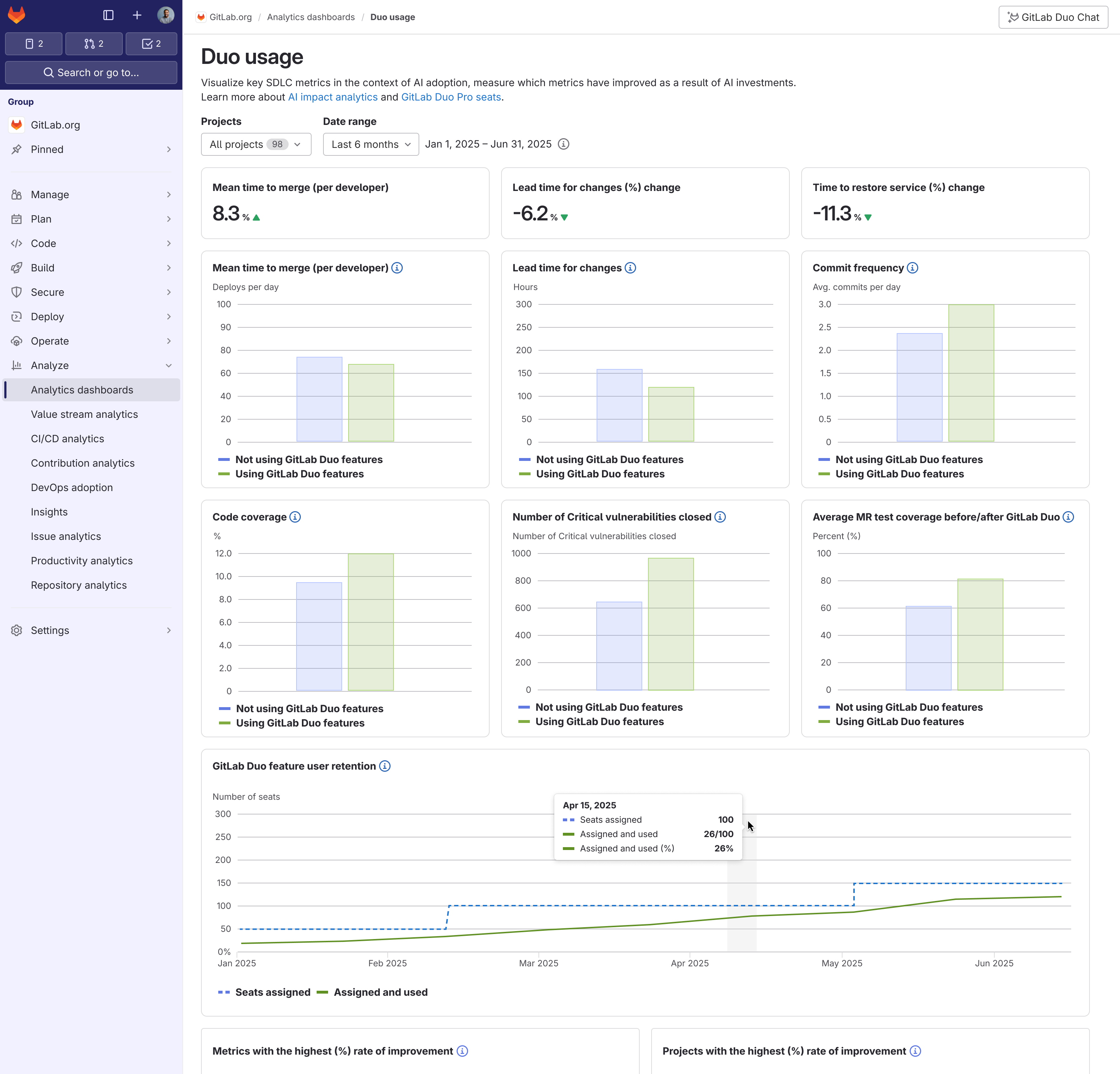
The final design proposal was to create two different dashboards, one that focused on adoption and the other on impact:
- Monitor AI adoption: Track adoption rates across teams to evaluate organizational strategies and maximize ROI
- Track performance improvements: Observe changes in merge request and pipeline metrics after AI adoption to assess business value

Two different dashboards for adption and impact
Outcomes
- Customers were thrilled with the quick turnaround time and validated value of the solution
- User research built stakeholder confidence in the long-term vision
- The design vision gave engineering a technical roadmap for data capture and aggregation
- Identified that one-size-fits-all doesn’t work - different teams measure productivity differently, requiring flexible, customizable approaches
Key Learnings
Working closely with engineers revealed gaps in our data visualization component library, which directly informed my next initiative which was to create UI guidelines and update existing data visulization components. This project taught me the importance of designing horizontal solutions that accommodate diverse workflows rather than prescribing a single approach.