Background
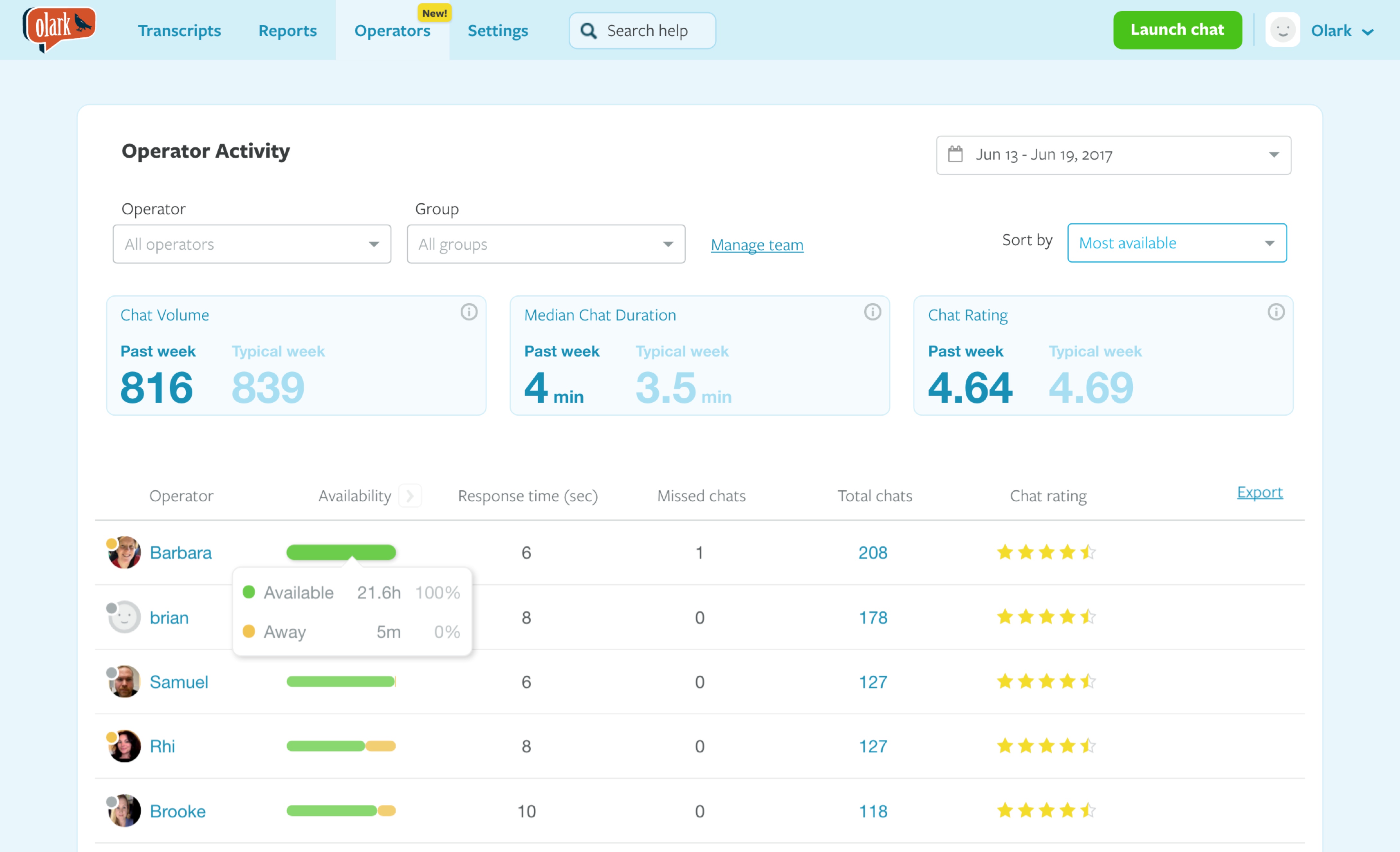
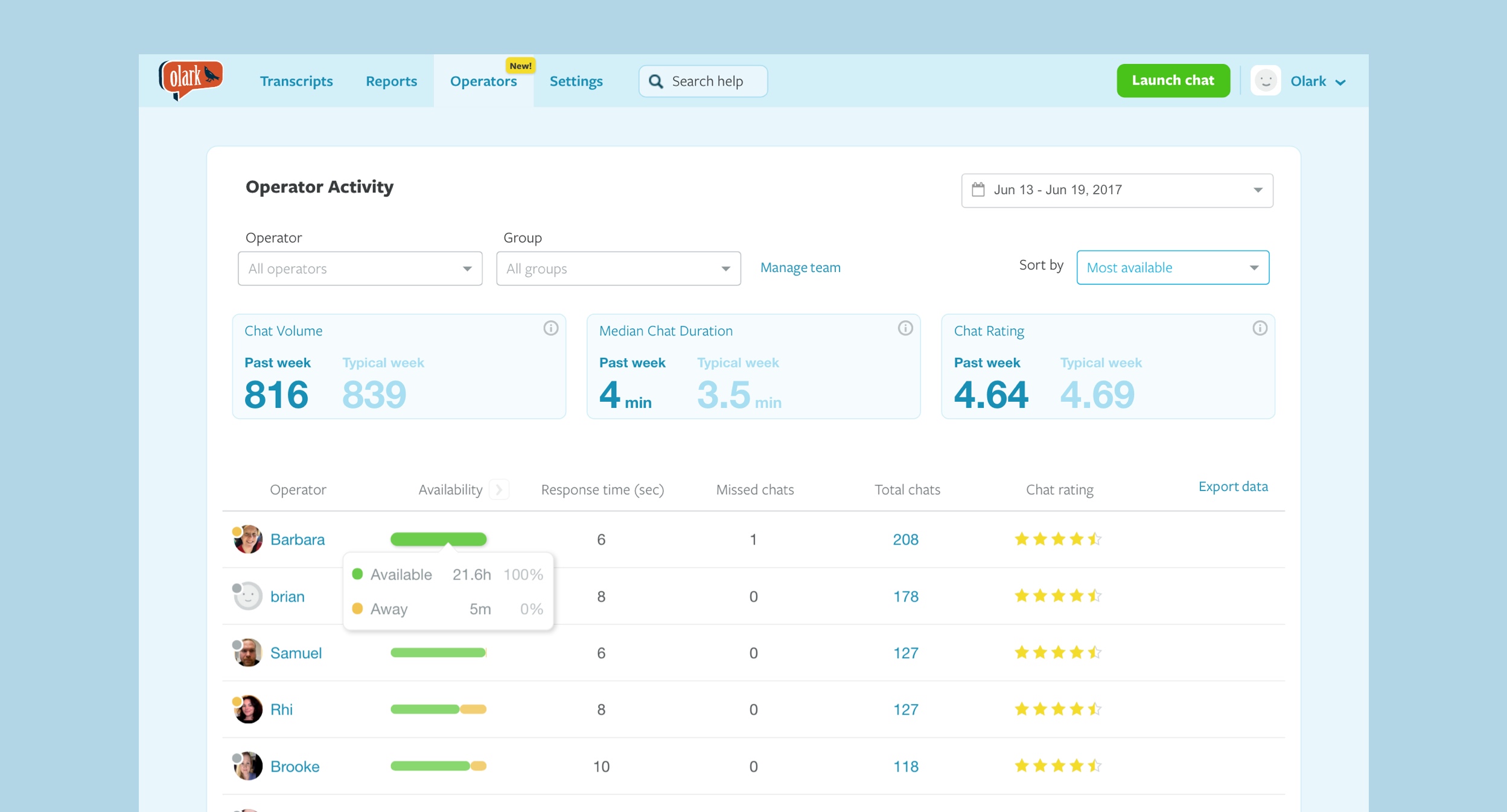
“Agent Activity” was a new feature on the Olark live chat platform that allowed managers to see their agents’ chat activity over time. Prior to this release, there was no historical record for managers to see how agents were doing.
My role
I was the lead designer on the admin experience team, which included one project manager and three engineers. I was responsible for assisting in scoping of the project with our PM, and then designing, validating, and presenting final design specs to our engineers.
The problem
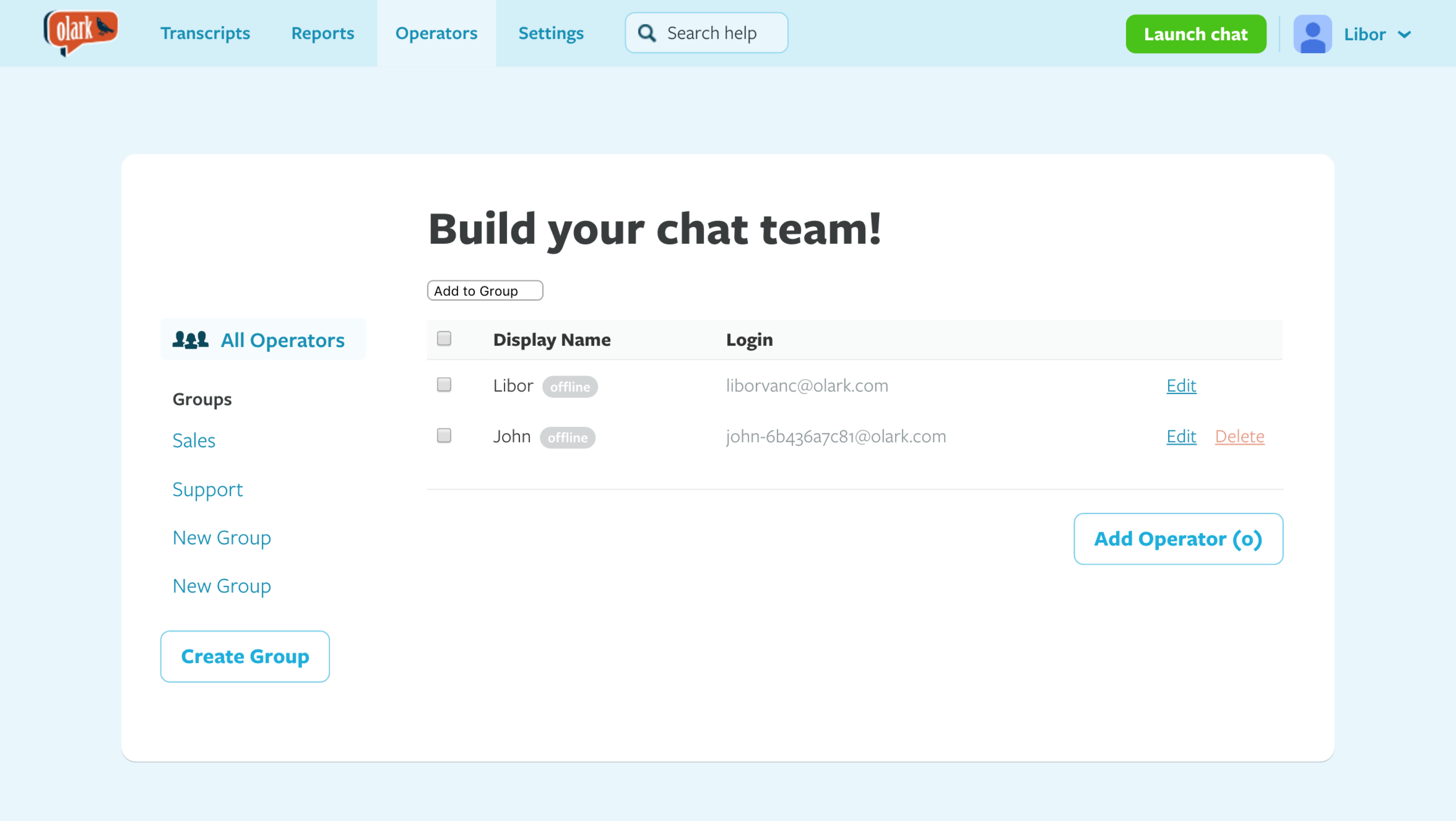
Access to daily metrics made agent activity transparent. This was one of our customers’ most frequently requested pieces of functionality — admins and managers wanted to know who was online and chatting, and how many conversations each agent was handling. Linking this data to real-time transcripts was critical to the success of training and escalation flows for teams.

Project goals
To understand more about what our admins needed, I read through all the prior support requests and backlogged JIRA items. I then worked closely with our Director of Product and PM to land on the following user stories that the new design needed to solve for.
As an admin I want to…
- View when each agent logs in and out …so that… I can see who my top agents are
- See how often each agent is set to away …so that… I can see who my top agents are
- See how often each agent hits chat limit …so that… I can understand how many agents I need to staff
- See how many chats each agent takes during each session …so that… I can understand my agents’ performance
- Export my current view as a CSV file …so that… I can import my data into other progress-tracking tools
Existing solutions
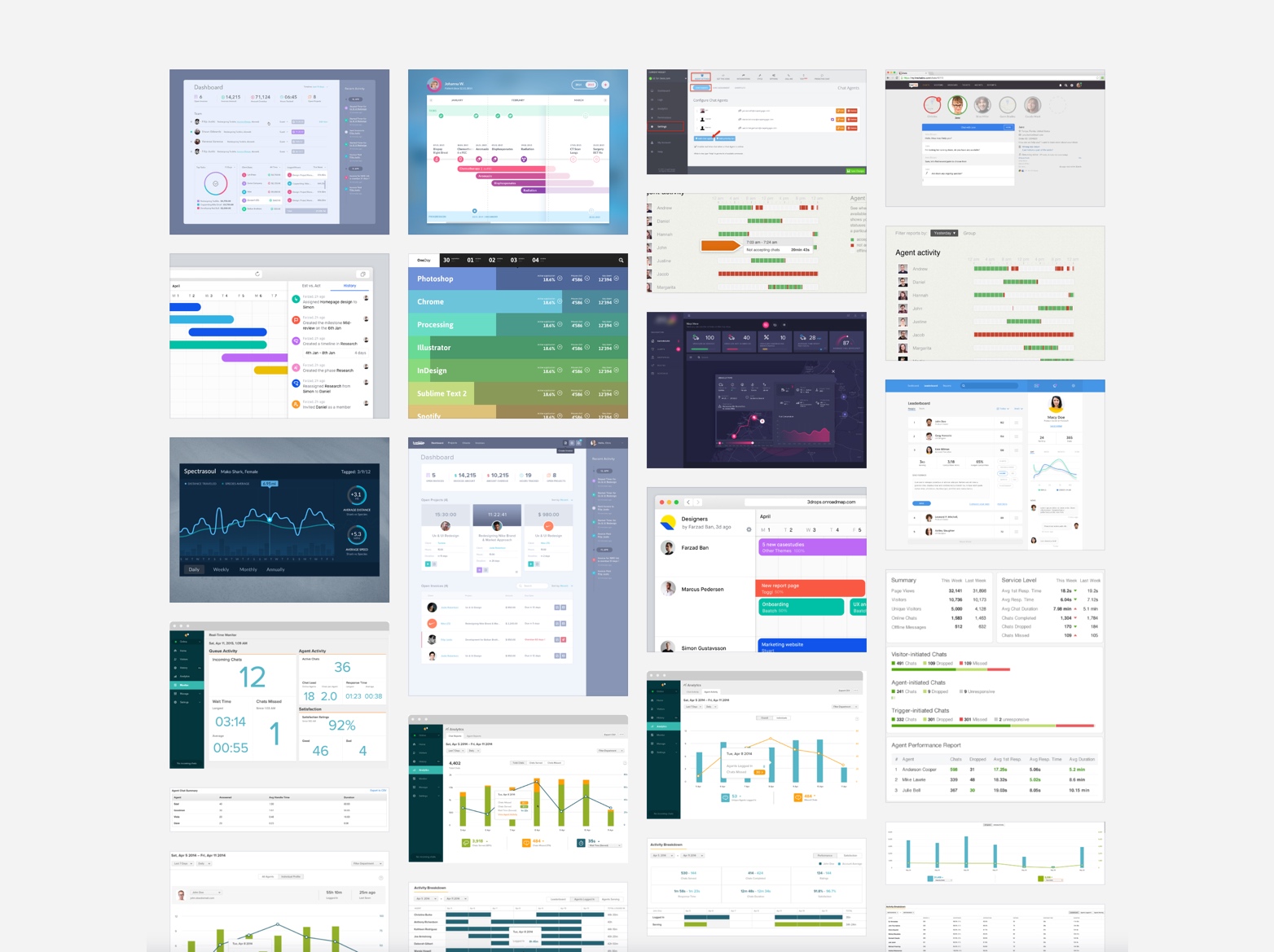
Before diving into low-fidelity wireframes, I researched existing solutions on the market along with other design patterns that visualize activity over time.
Solution generation
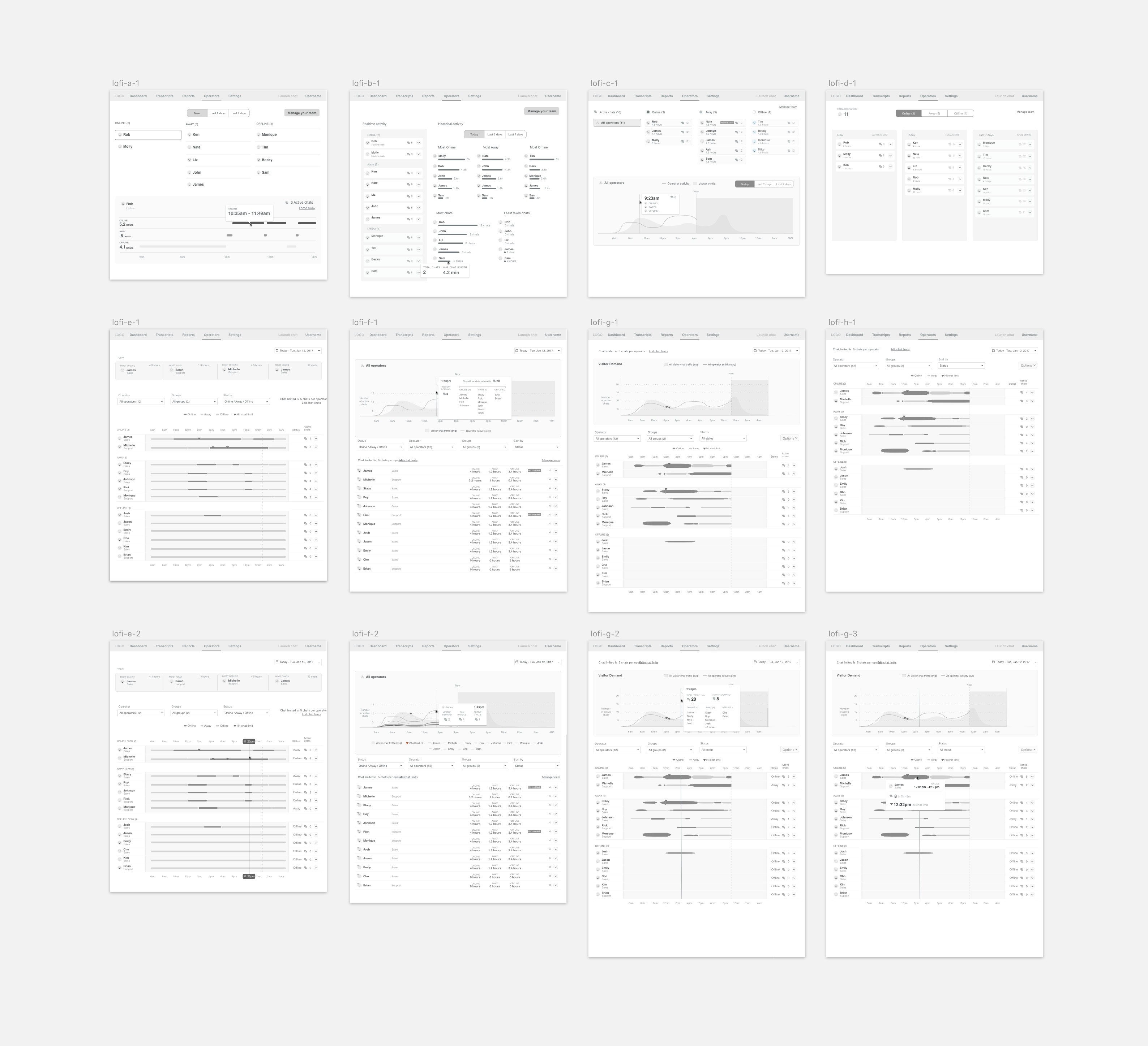
With my list of user stories in hand, I brainstormed lo-fi solutions. I generated many options for how to visualize an agent’s activity while solving for all the project’s goals.
A difficult part of this project was striking the balance between showing too much information versus too little. One thing I heard often from existing Olark customers was that they loved the product because it was “simple.” With that in mind, I focused on making the information glanceable, with the option to see more if needed.
Visual design decisions
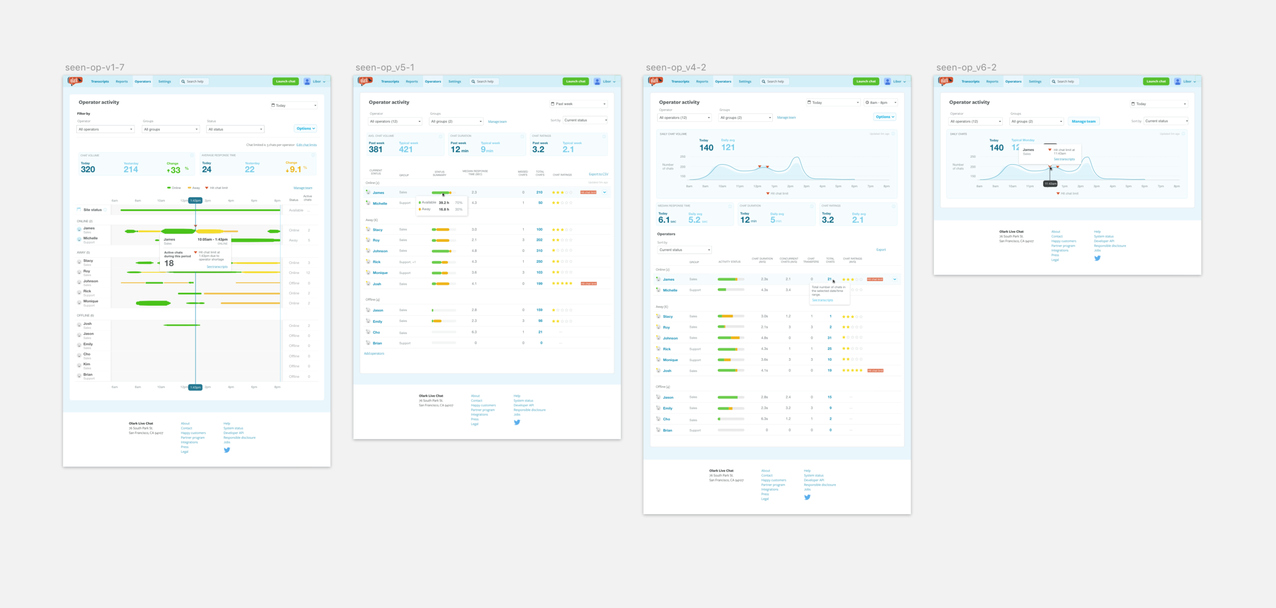
My initial visual designs were more ambitious — and, it turned out, too busy. I had been encoding multiple dimensions into a single activity bar: the height of each bar varied based on the time an agent was available, and there were three color codings layered on top to communicate different states. The result looked visually rich and interesting, but it wasn’t doing the one job it needed to do: help admins answer their questions at a glance.
I stepped back and stripped the visualization down to what actually mattered. Three deliberate choices made the difference:
- Removed a dimension. I made the height of every activity bar uniform, so admins weren’t being asked to compare both length and height simultaneously.
- Reduced the color palette. I cut from three colors down to two — active and inactive — so the eye could parse status without translation.
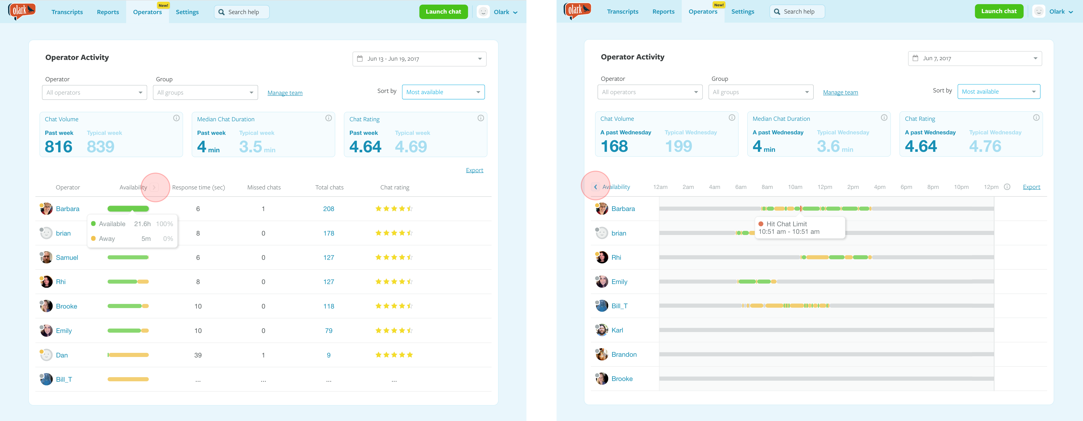
- Split the views. Rather than cram every story into one visualization, I created separate Summary and Day views, each optimized for a different question.
The trade-off was real: the simpler design looked less visually distinctive than my earlier explorations. But it made the interface glanceable, which was the bolder choice for this product.
Internal feedback and validation
Using my lo-fi mockups in InVision, I solicited feedback — first from other designers within the company, and then from our engineers and two of our support leads. I repeated this process a few times until I had eliminated elements from the UI that didn’t hold up.
External feedback
After a few internal iterations, I designed a set of hi-fi mockups with greater confidence. At this stage I needed to make sure my solutions would make sense to actual admins. The engineers on my team had also raised a few questions that needed validation.
To validate the solutions with real admins, I built a prototype in InVision and scheduled video calls with seven admins (existing customers), asking them to share their screen while they completed a series of tasks in the prototype.
Learnings
The design still didn’t answer the question of how their agents were doing today or right now. There was also too much information to parse — the interface was trying to tell too many stories at once. I ended up splitting it into two separate views, Summary and Activity (or Day) view, with a way for admins to switch between them.
Impact
The update was well received — both in positive feedback our support staff captured via chat and in a reduction in support requests. However, after monitoring the release for a week (using VWO and Amplitude), we saw that very few admins were viewing the Day view. We followed up by updating the UI to make the control that switched between Summary and Day views more discoverable.